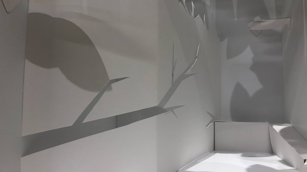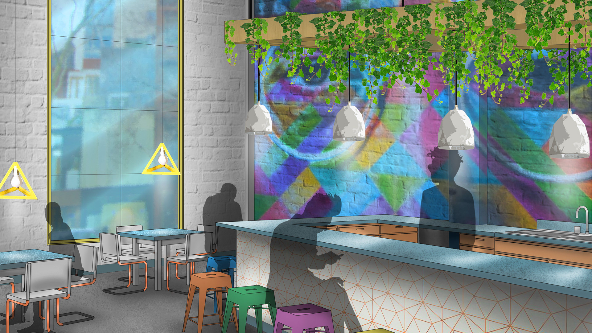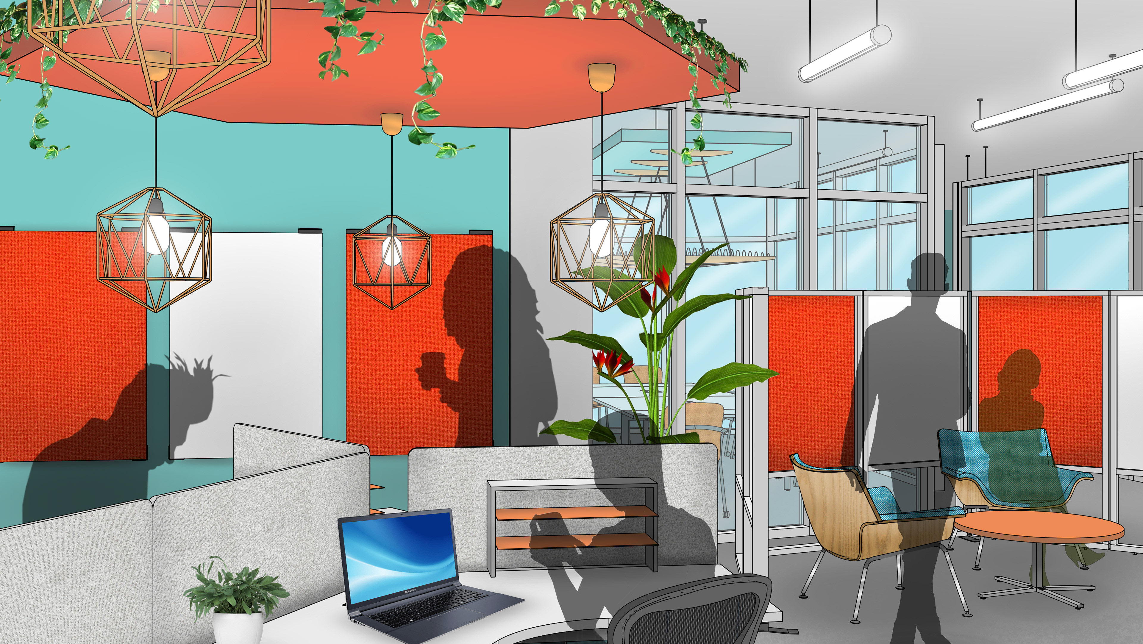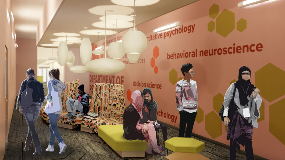
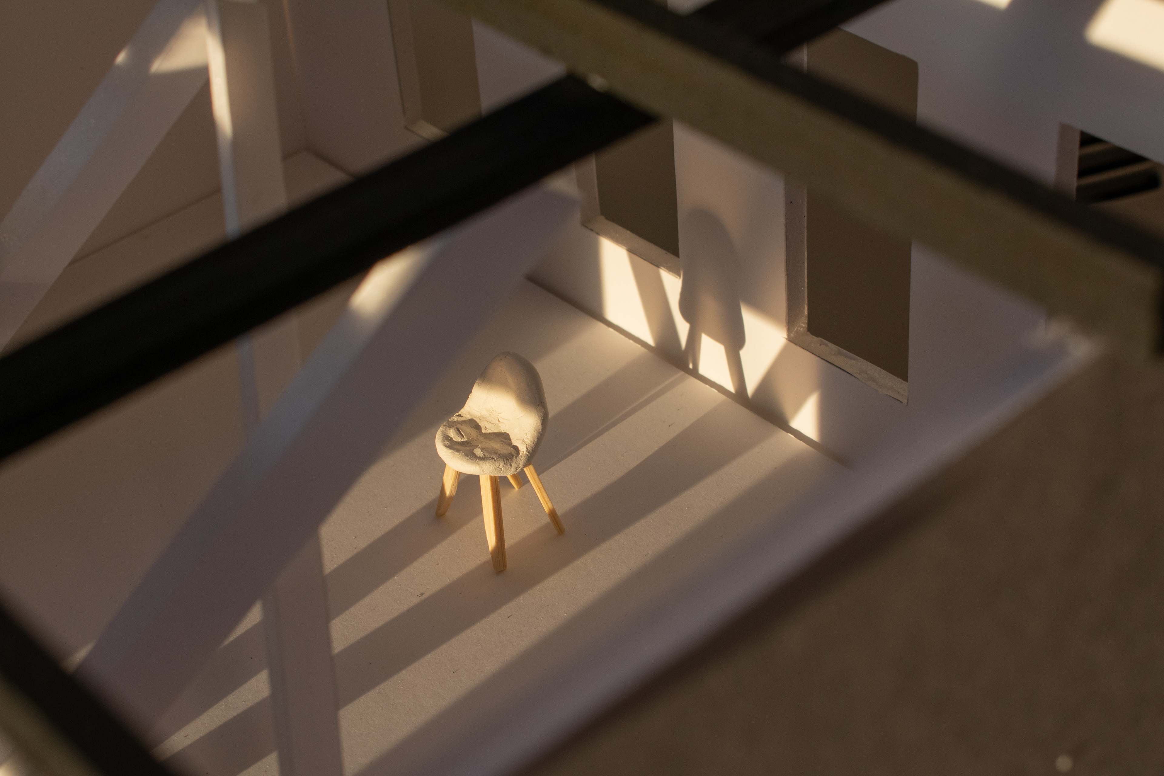
The goal of this project was to create a museum space that was meant to showcase a single chair. The chair I was asked to showcase was the molded plastic chair by Charles and Ray Eames. The museum space was to be inspired by the design of the chair as well as the Eames's design philosophy.
We began by doing visual studies of our individual chairs; we were to explore how they looked from various angles, what materials they were made of, and how they were constructed. After understanding the form of my chair, I began sketching parti diagrams of potential floor plans, focusing on the criss-crossing structure of the chair legs.
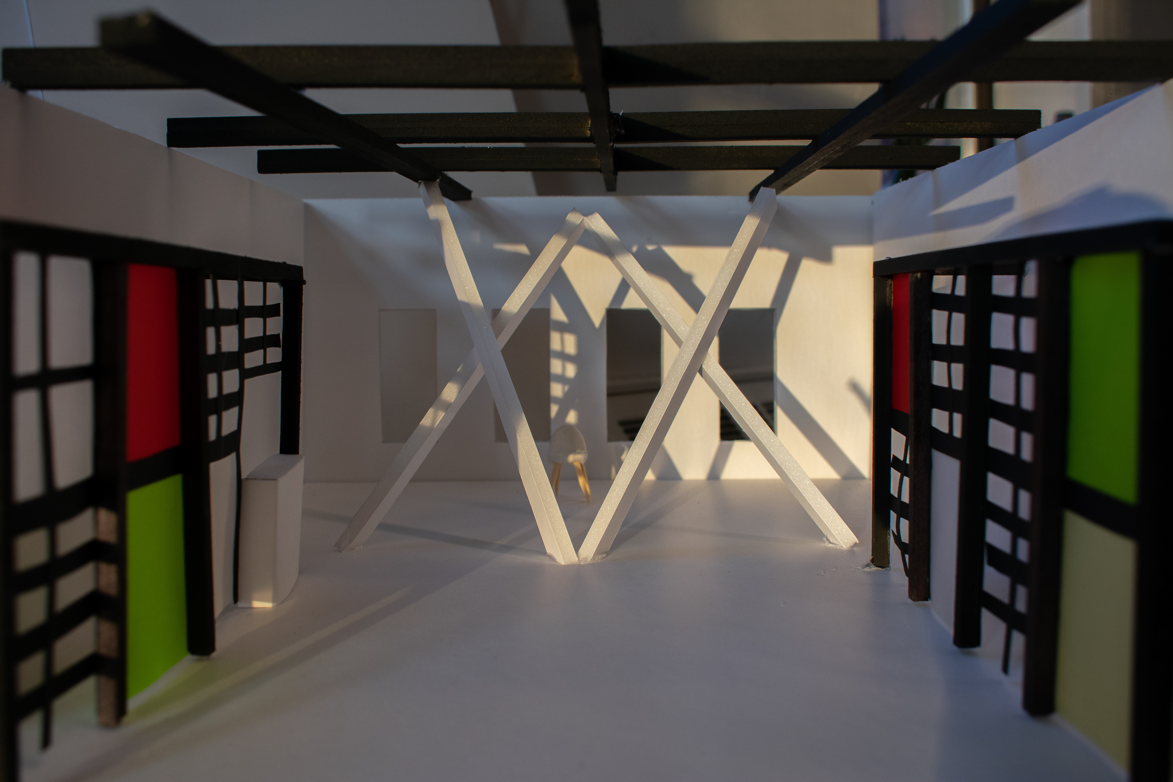
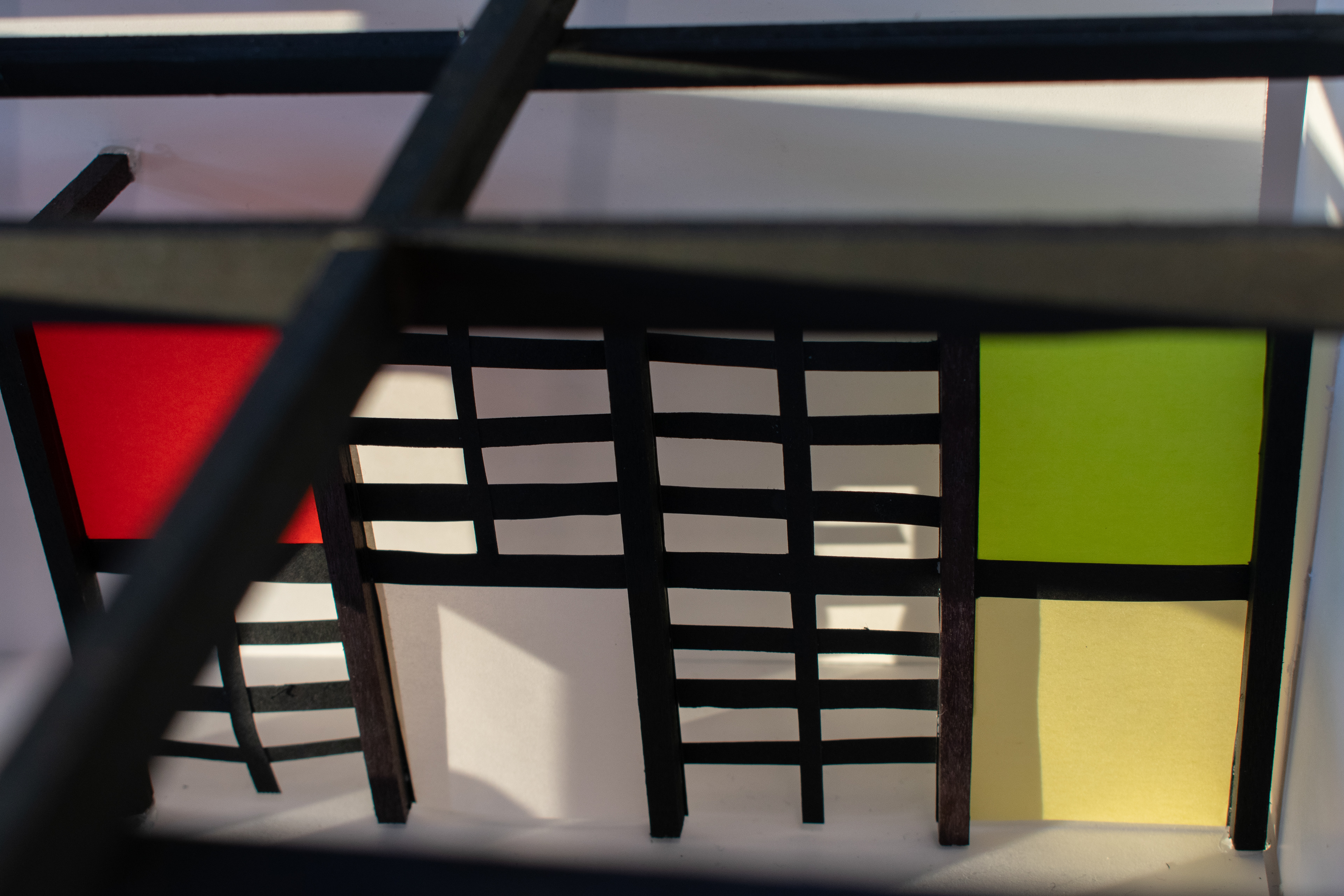
The final space became a very linear experience that drives the user into the space, juxtaposed with large diagonal pillars that create a frame around the single chair at the far end of the room. The space is open, simple, and straightforward, reflecting the ideas of Charles and Ray that design should be functional, beautiful, and accessible to all. The Eames's believed that a design did not have to be complicated or expensive in order to be pleasing to look at, and they are considered two of the most influential mid-century modern designers. The grid-like walls and ceiling are modeled after the Eames's residence in California, and the white pillars mimic the crossing wires of the chair, the force that holds the entire chair together.
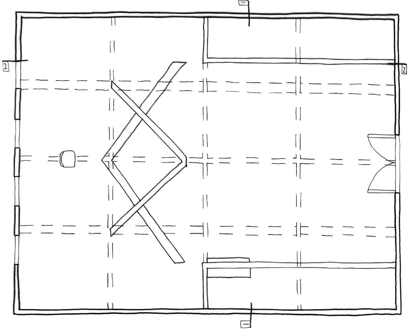
Floor Plan
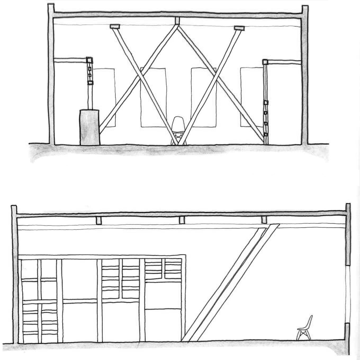
Sections
Tools used in project: hand drawing, 3D construction, Adobe Photoshop.
