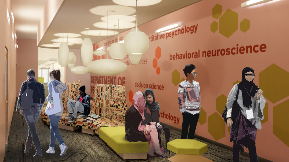
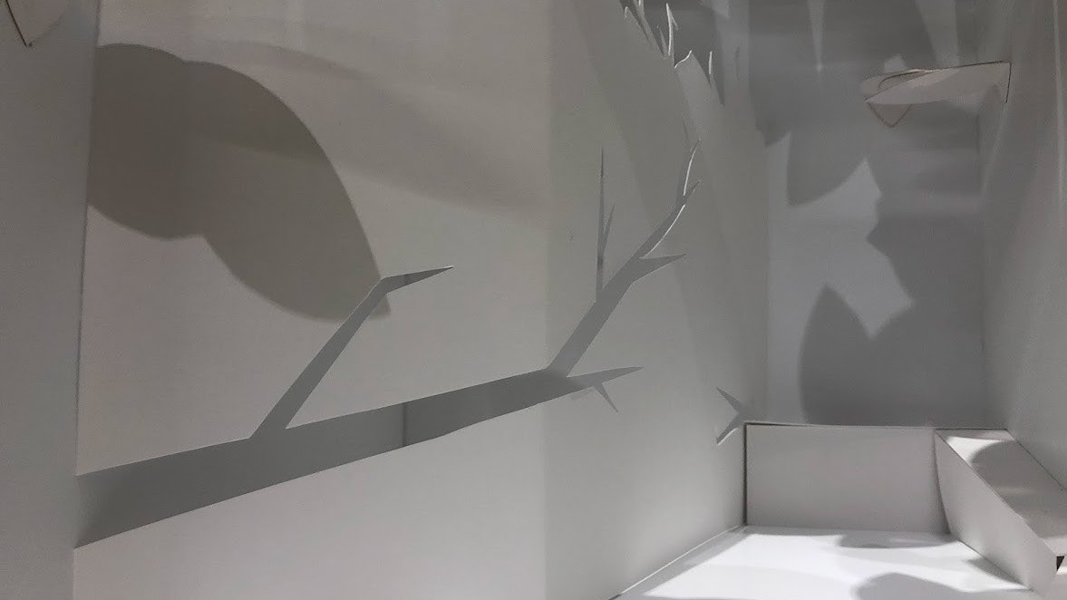
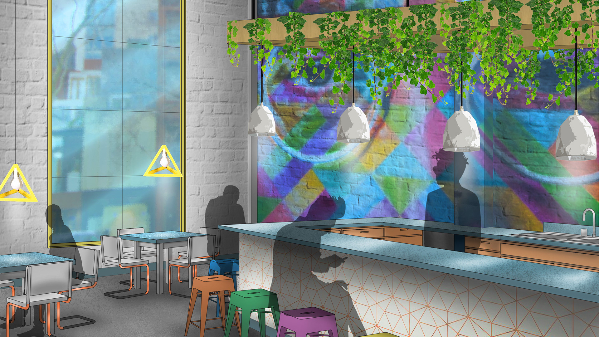
Rendered perspective showing part of the main staff area and brainstorming pod.
Working with a hypothetical space within a building located on the High Line in New York City, we were asked to design a corporate office space for a digital marketing startup company. To create the space, we were to incorporate furniture and typical layouts from one major manufacturer; in my case, I chose to work with Herman Miller. Biophilia and biomimicry were also two major focal points to be considered in the design.
There were a lot of programmatic requirements to this assignment, so starting with some bubble diagramming and block planning helped me plan out how everything would fit into the space.

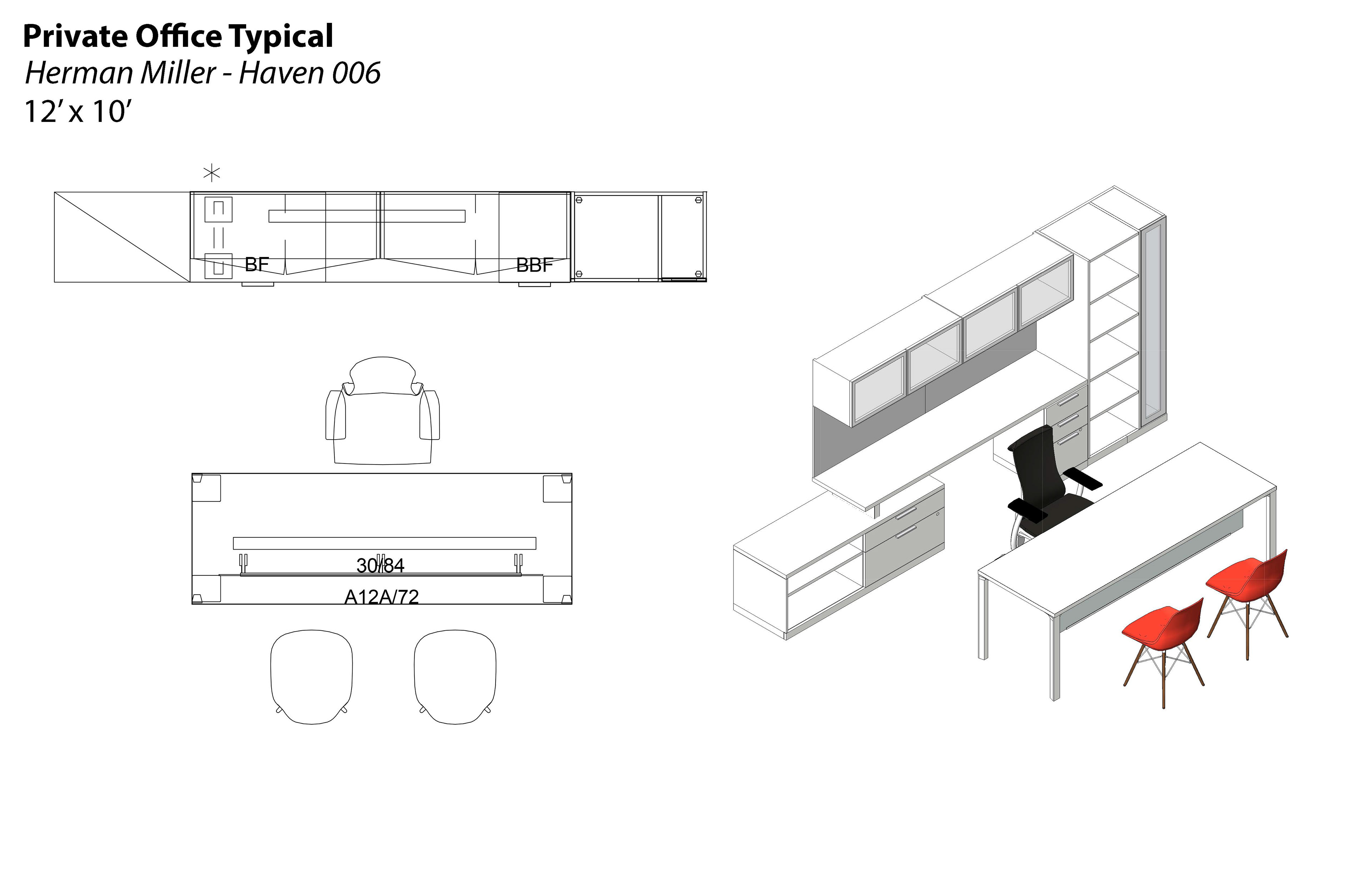

While figuring out some potential floor plans, I also began picking out some typical layouts to work with in my various spaces. I was inspired by the hexagonal forms of some of the configurations, and decided to build off of the idea of a beehive: where teamwork and community thrive. This mentality is important to have in an office environment, so I wanted to create a space that reminded workers that they are each a crucial part of the greater structure of the office.
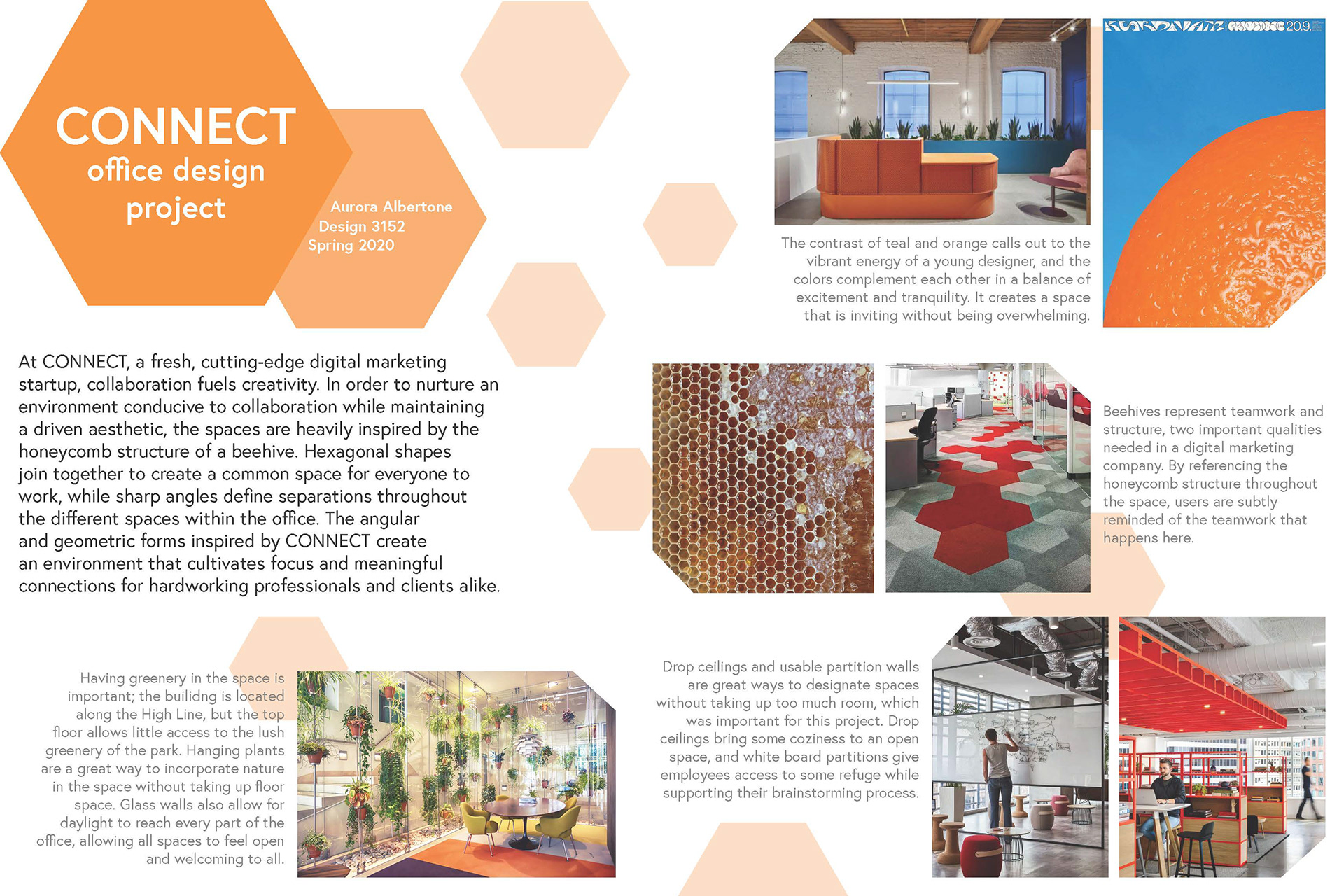
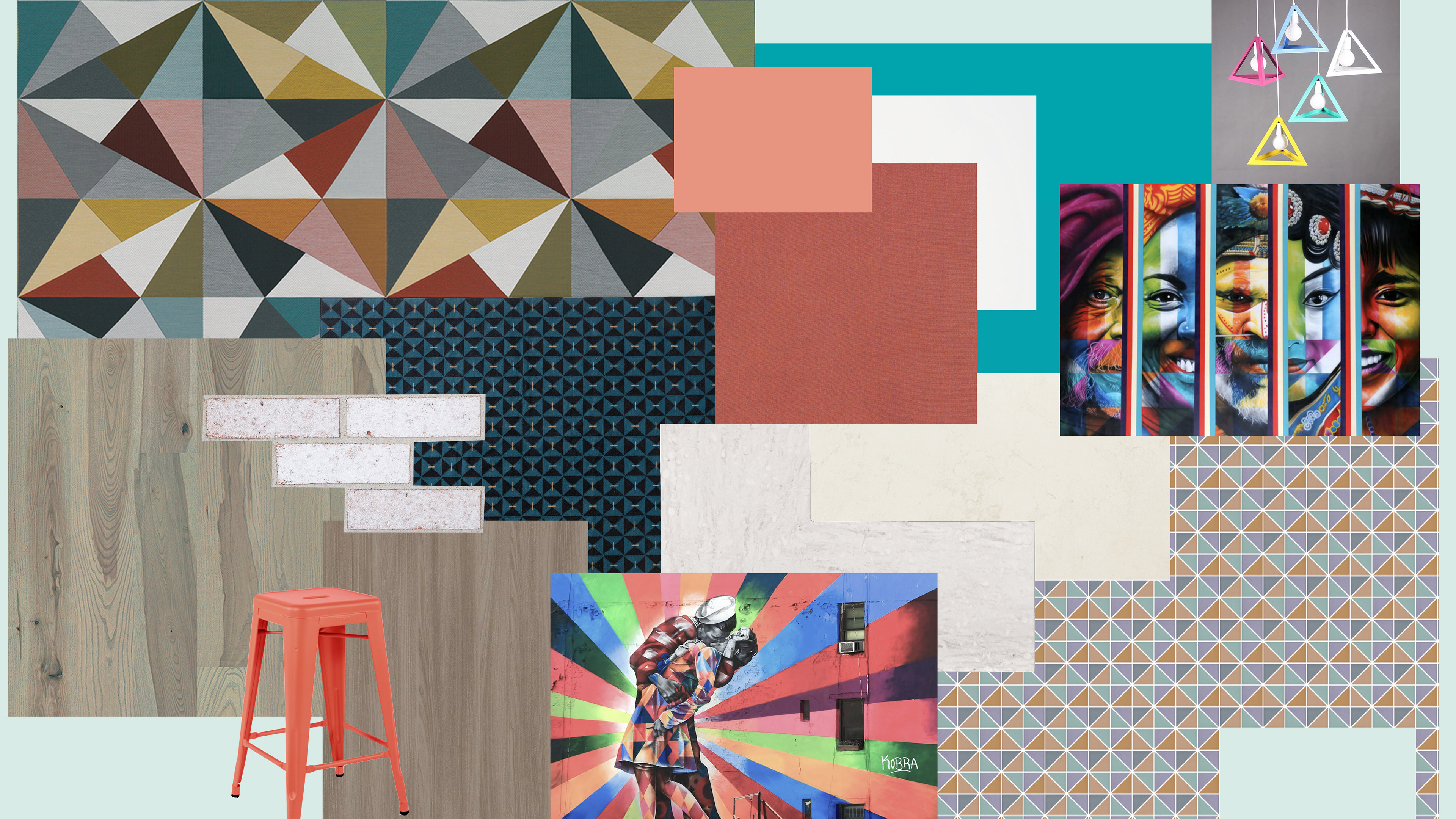
Aside from the honeycomb structure, I collected some other inspiration images of biophilic design, collaborative spaces, and colorful offices to include in my presentation, and to help explain my design decisions to my professors and peers since this project was submitted digitally due to COVID-19 disruptions.
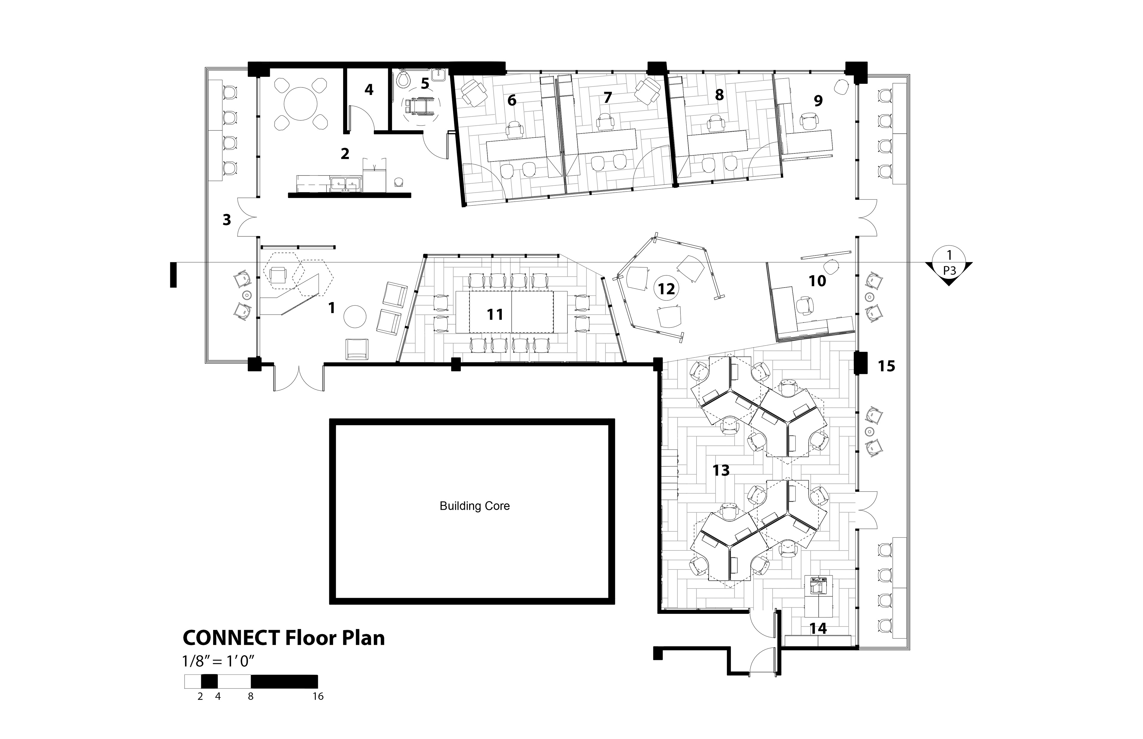
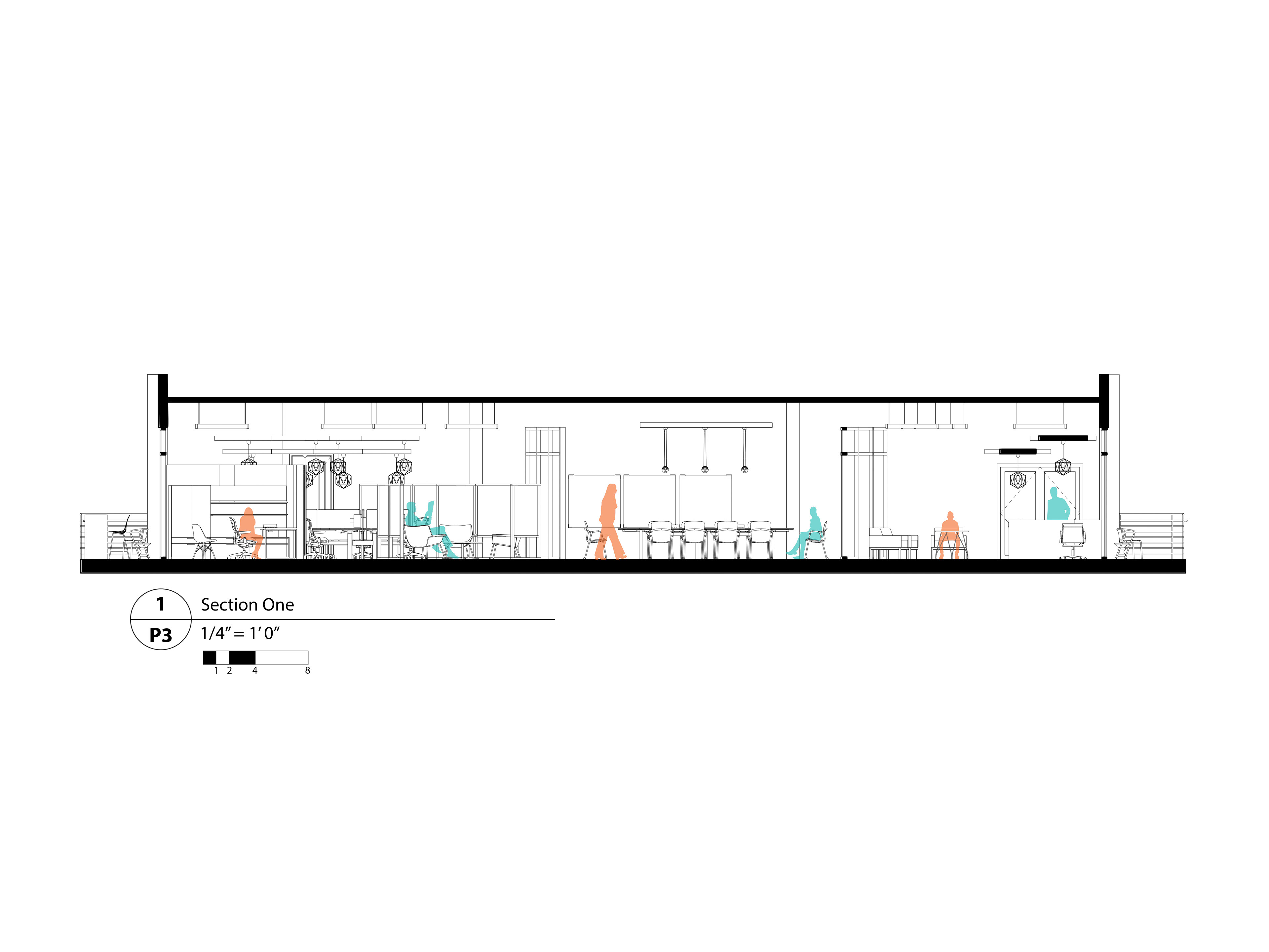
The final floor plan of the office is very energetic, using canted angles to create a more visually compelling, unique space. The hexagon shape can be seen in many parts of the office, from the desk configurations to the lights and drop ceilings. The private offices and large conference room have glass curtain walls to create a sense of transparency and togetherness in the office, as well as to keep the spaces from feeling too cramped and small. The break area behind the reception desk is very linear and static compared to the rest of the office in order to provide a calm and cozy place for employees to relax, escaping the buzzing energy of the main "hive".
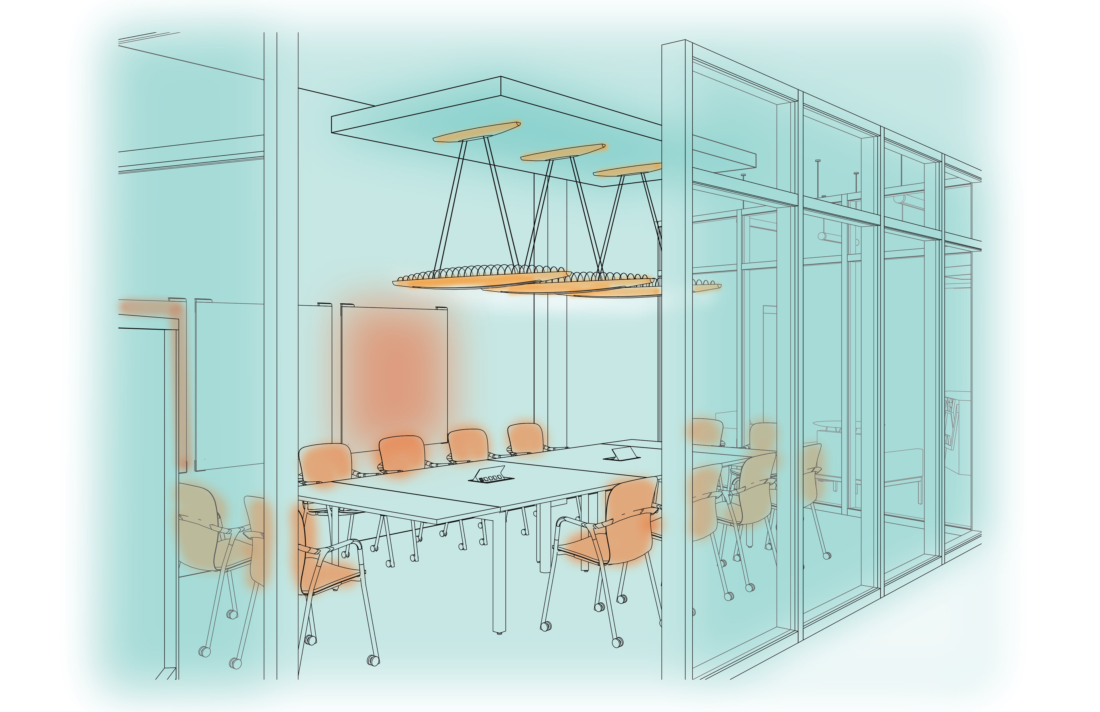
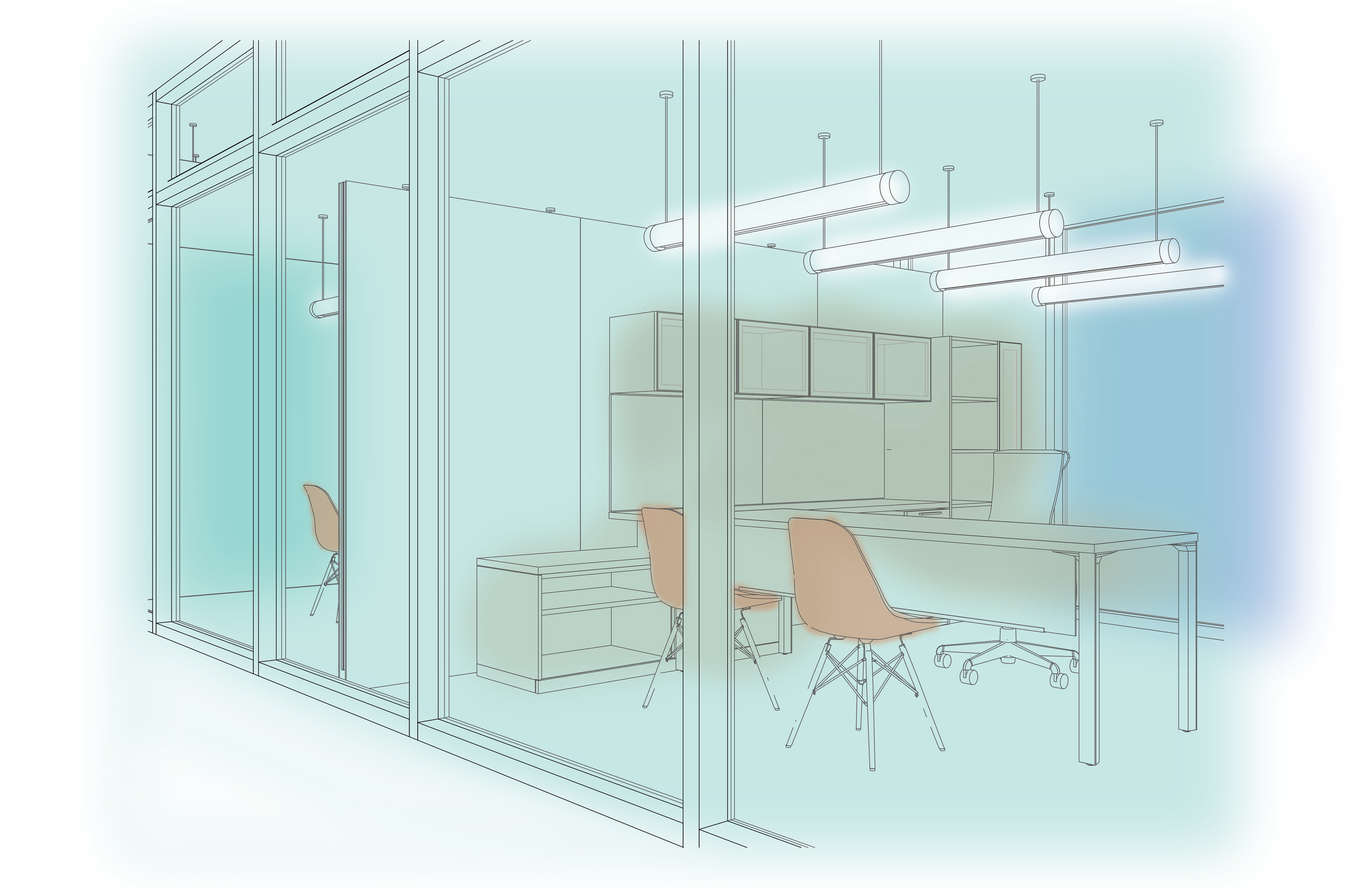

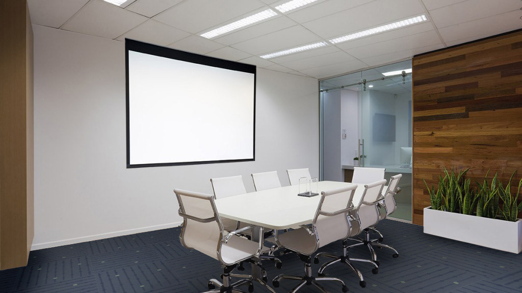
We were only required to make one rendered perspective for this assignment, but since the office had so many unique spaces, I included some extra perspectives of the space to show what some of the other parts of the office would look like.
Tools used in project: Autodesk Revit, Adobe Photoshop, Adobe InDesign.
